Book Cover Analysis
General Analysis of the Covers
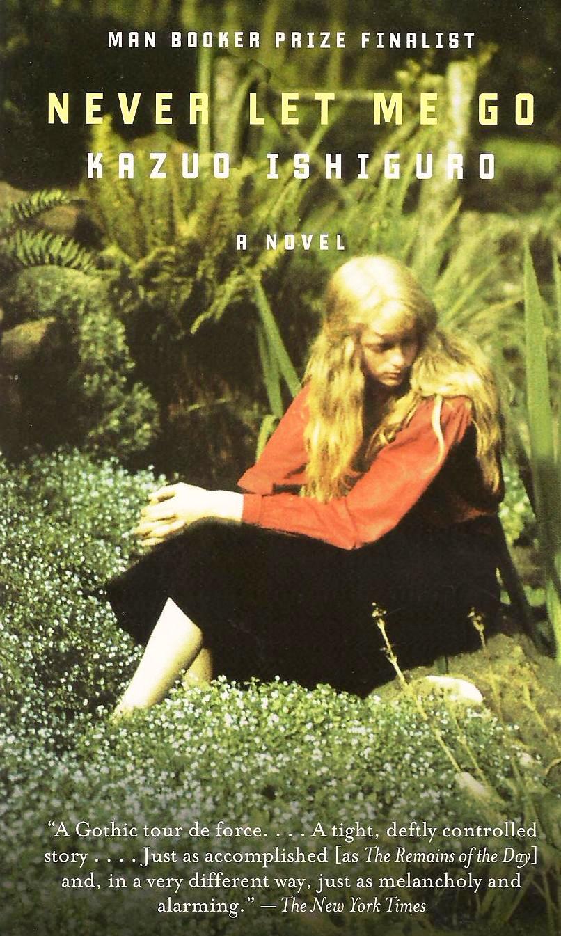
This book cover has a girl on the cover with long blonde-draped hair over her shoulders looking down upon the flowers. She appears to be very sad. She is sitting down in a field alone. The title of the novel is placed above her head drawing emphasis on the girl rather than the title. Because she is seen looking away from the title it is implied that something has been let go since she is denying the name of the novel. Her overall appearance is very different from the second image since she has different colored hair. Her attire also appears to be more classier and gloomier than the other girl. The image is also sharper, but still has a haze around her head. Considering the actual plot of the book, the actual portrayal of the plot is correct in the fact that it is actually a sad novel. However, there is no clear description of what the main character, Kathy, looks like. The field is not entirely mentioned either. The only time it is really mentioned is when people are playing football on the field and when Kathy passes by some fields as she is driving.

This cover is a lot more simplistic. It shows a little girl who appears to be playing. The yellowish-orange background coupled with the blurred image of the girl playing stresses the past and plays on the title "Never Let Me Go." The title is seen right in the center of the novel drawing more emphasis on what the actual book is. However, the size of the font is almost identical to the author's text size. This provides the author with equal credit.The background color appears to be a gradient; going from dark to light. This also plays on the fact that something is being let go. It implies to the audience that it has something to do with the past. Because a little girl is seen on the cover of the novel, it can be implied that it must have something to do with youth and vitality.
 For this cover of the novel, the emphasis appears to be draw on the author Kazuo Ishiguro since his name is larger than the actual title. Usually we think of book covers following these conventions: Title, Author, background, and occasionally a little excerpt about how great the author/ novel is below. Instead, this cover appears to have the credibility of the book on both the top and bottom of the cover, which once again emphasizes the credibility of the Ishiguro. In addition, the overall background of this novel appears to be more grim. However, the lighter area of the book surrounds Ishiguro's name rather than the title of the novel. The background appears to be playing off of a scene that was towards the end of the book where it is Kathy, Tommy, and Ruth's last road trip together to this beached boat. This scene was kind of their acceptance of their trio finally ending, which stresses on the title "Never Let Me Go." Although this is something someone would only be able to recognize if the have read the novel, the grimness of the background alludes that this book does not have the most pleasant ending.
This cover is a lot more simplistic. It shows a little girl who appears to be playing. The yellowish-orange background coupled with the blurred image of the girl playing stresses the past and plays on the title "Never Let Me Go." The title is seen right in the center of the novel drawing more emphasis on what the actual book is. However, the size of the font is almost identical to the author's text size. This provides the author with equal credit.The background color appears to be a gradient; going from dark to light. This also plays on the fact that something is being let go. It implies to the audience that it has something to do with the past. Because a little girl is seen on the cover of the novel, it can be implied that it must have something to do with youth and vitality.
For this cover of the novel, the emphasis appears to be draw on the author Kazuo Ishiguro since his name is larger than the actual title. Usually we think of book covers following these conventions: Title, Author, background, and occasionally a little excerpt about how great the author/ novel is below. Instead, this cover appears to have the credibility of the book on both the top and bottom of the cover, which once again emphasizes the credibility of the Ishiguro. In addition, the overall background of this novel appears to be more grim. However, the lighter area of the book surrounds Ishiguro's name rather than the title of the novel. The background appears to be playing off of a scene that was towards the end of the book where it is Kathy, Tommy, and Ruth's last road trip together to this beached boat. This scene was kind of their acceptance of their trio finally ending, which stresses on the title "Never Let Me Go." Although this is something someone would only be able to recognize if the have read the novel, the grimness of the background alludes that this book does not have the most pleasant ending.
 This cover also plays on the grimness of the story. It also focuses on the donor process of the novel since there appears to be a torso appearing on the front with outlines of some vital organs being displayed within it. This once again plays on the idea of the vitality. This depiction of the torso was drawn rather than having an actual image of a torso. This appears to also allude to the idea of youth. The outline around the corpse appears to look like barbwire. This reflects the desire of wanting to be free, especially since the outdoors appear to be seen behind the torso. For those who have read the book they would also understand the internal conflict that all the clones have to come to grips with; understanding that their fate has been determined. The font size of the title is very interesting as well. Firstly, the title appears to be much larger than the author's name which is located below the title. Secondly, the word "Never" appears to be slightly smaller and more put off than the words "Let Me Go." This alludes to the fact that something is being let go. However, it is not necessarily indicating what is being let go. There also appears to be a faded background of some trees behind the torso.
Cover #2 vs. Cover #4
Both covers appear to be emphasizing on the idea of vitality and youth, but through different interpretations. In Cover 2, a blurred image of a little girl is seen while on Cover 4 a child's drawing of the human torso is being seen. Both appear to show this transcendence to adulthood through the the backgrounds as well by associating dark colors with light colors. However, the positions of their texts draw emphasis on different parts of the novel. For instance, the author's name is seen first on Cover 2 while the title is seen first on Cover 4.
The first thing that came to mind when I first saw Cover 2 was childhood. I thought about a kid playing in a windy field. If I hadn't read this book I would have thought that this novel was written by a middle aged woman reflecting on her adolescence. Because of the author's last name I assume that he is Japanese, because my best friend is Japanese. The little girl seen on the cover kind of looks like she is wearing an Asian dress. This leads me to believe that this cover was most likely developed by Ishiguro's team, because the text is written in English, rather than Japanese. For Cover 4, the first thing that came to mind was cancer since I saw the lungs, liver and small intestine. I would have thought this book was about a man dealing with some form of cancer trying to say goodbye to his family and friends. I think that this cover was most likely made by a British company,because of the dark and gloominess of the outdoors. The setting of the novel was said to take place in the U.K. which is known for their rainy weather, and the fact that Ishiguro was raised in the U.K., so I thought that this was just. I also recognize the name Andrew Garfield who is an English-American actor, so I definitely knew that this was a western-made cover created post the film production of the novel Never Let Me Go.
Hey Anu!! I really like you analysis of the book covers!! Personally, my favorite cover is the fourth one because it is dramatically different from the cheerier covers. The dark gray background immediately creates a sense of gloominess in the reader. Also, I agree that the barbed wire outline is alluding to the theme of freedom, or lack of it since the characters are first kept at Hailsham, then the cottages. However, what interests me the most is the outline of the organs which hint at the donations. I believe that this is a very daring cover, as it focuses on the negative portions of the book. Overall, I agreed with your analysis, especially your comments about title vs author font size!!
ReplyDeleteI really liked how you focused on the title, the author and the font size when analizing these book covers. I thought it was interesting how you connected the picture on the cover and the written title. Also, I like that the 4th cover foreshadows the organ donation and doesn't focus their expercience in Hailsham. I didn't even see the barbed wire when looking at the cover, but I agree that it symbolizes freedom.
ReplyDeleteThis comment has been removed by the author.
ReplyDeleteYour analysis was very detailed; however, I would take note of the book covers that have awards listed towards the tops of covers 1 and 3. I think the significance of having those achievements on the cover may attract a certain audience to the novel. Those covers also seem more approachable to me because the pictures in the background are relatable compared to 2 and 4 where they seem like works of art rather than photos.
ReplyDelete